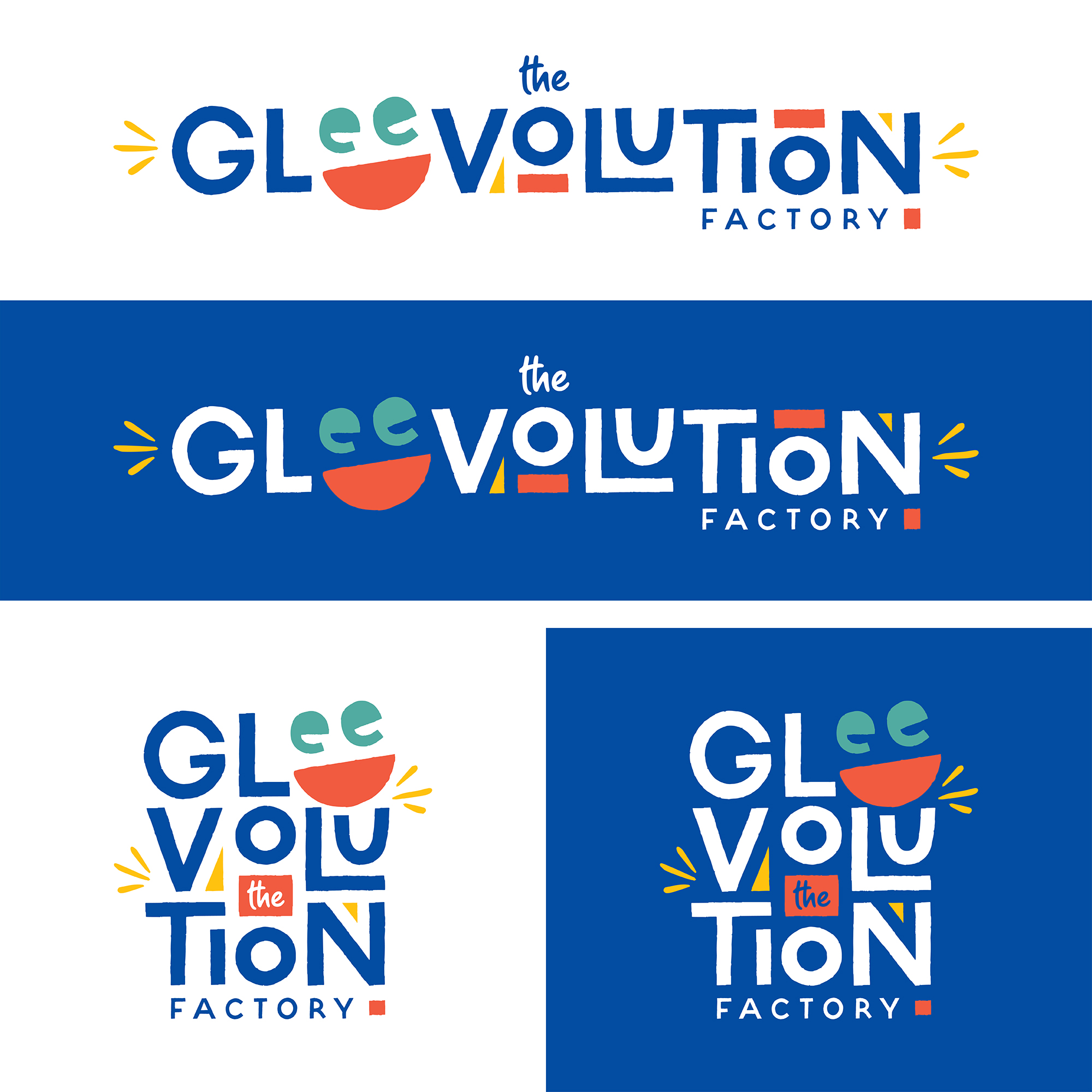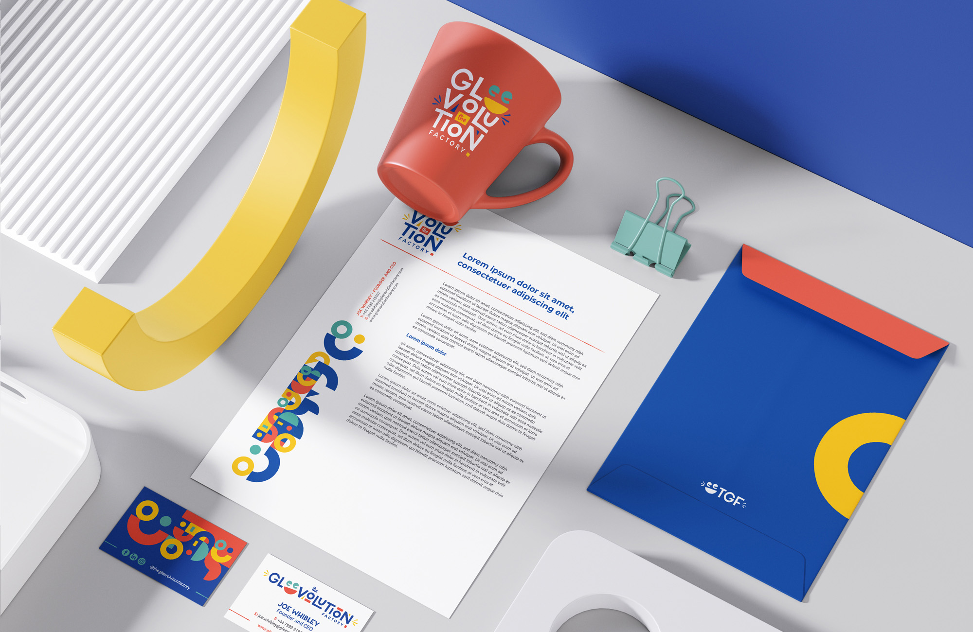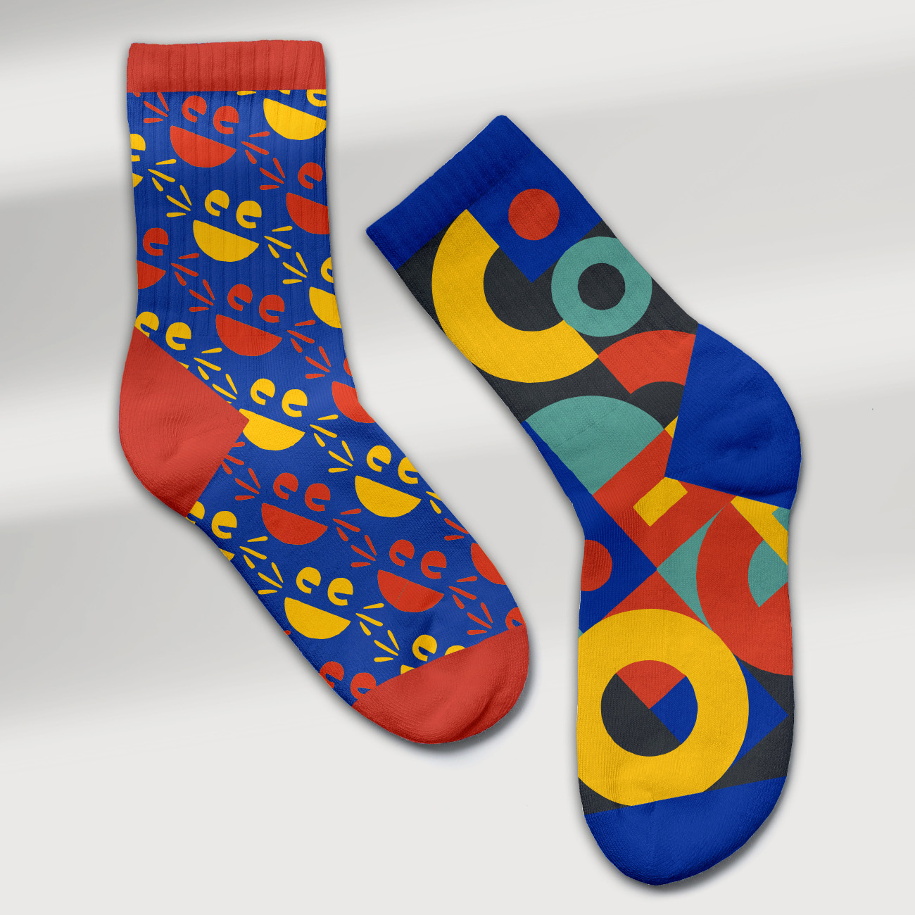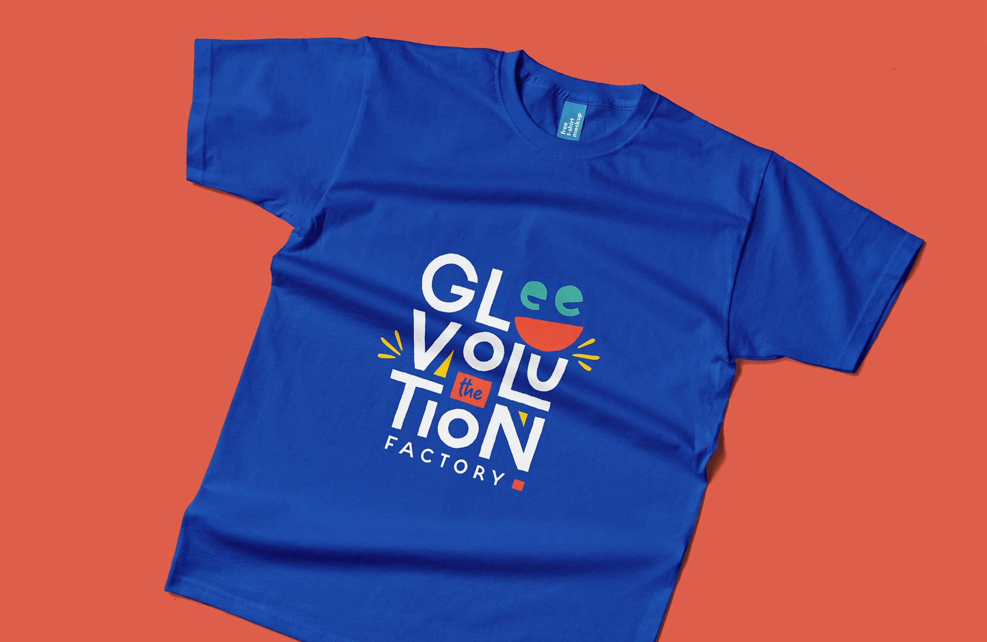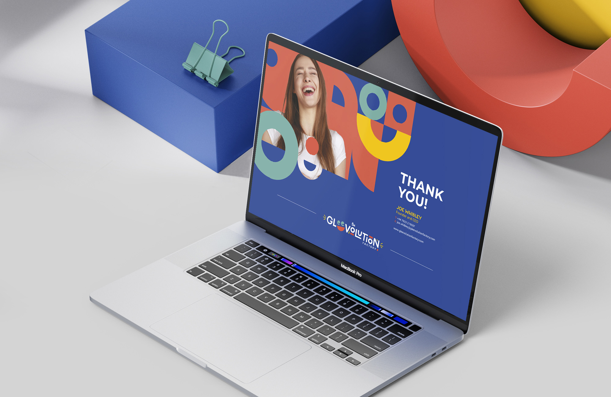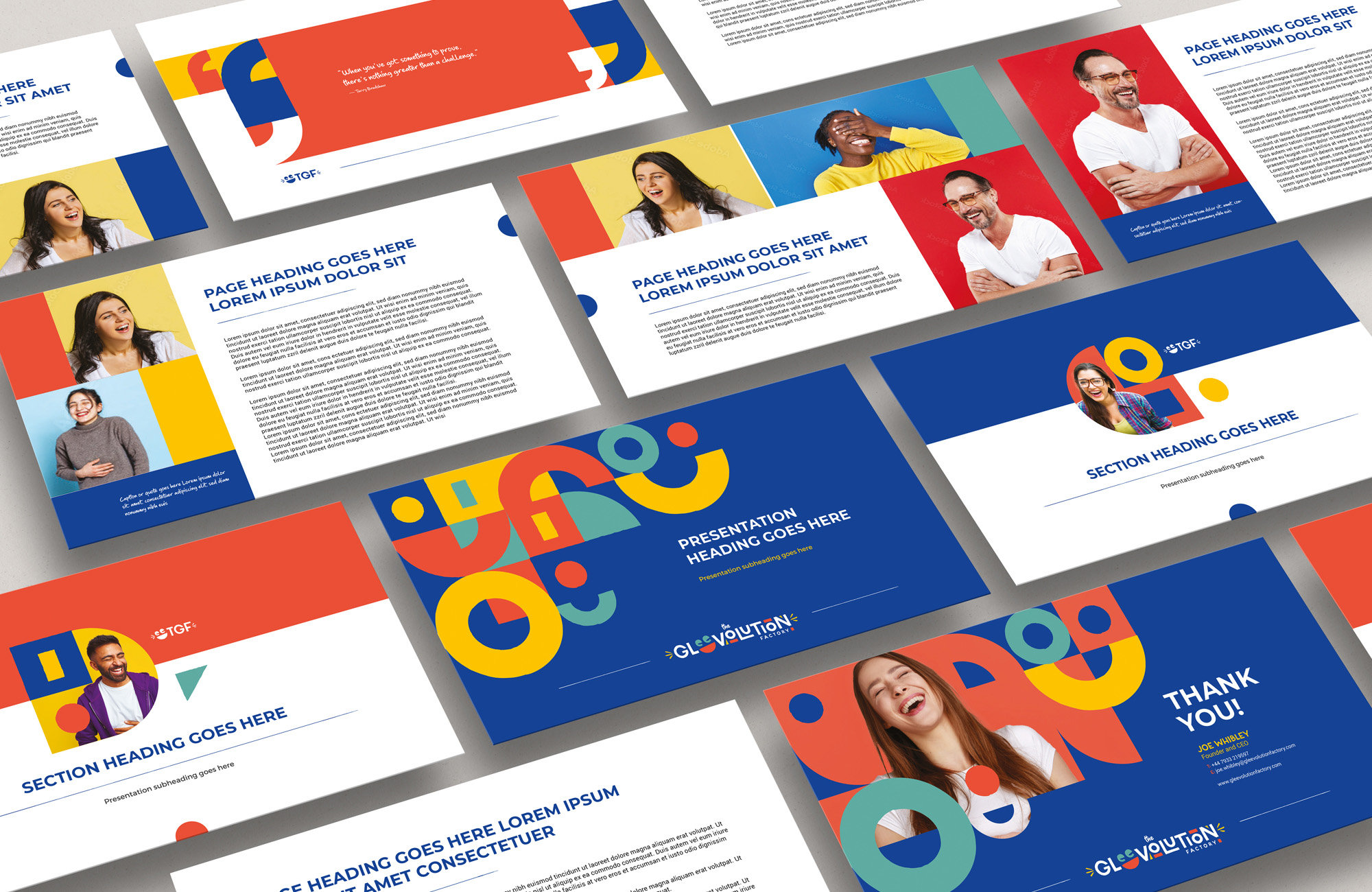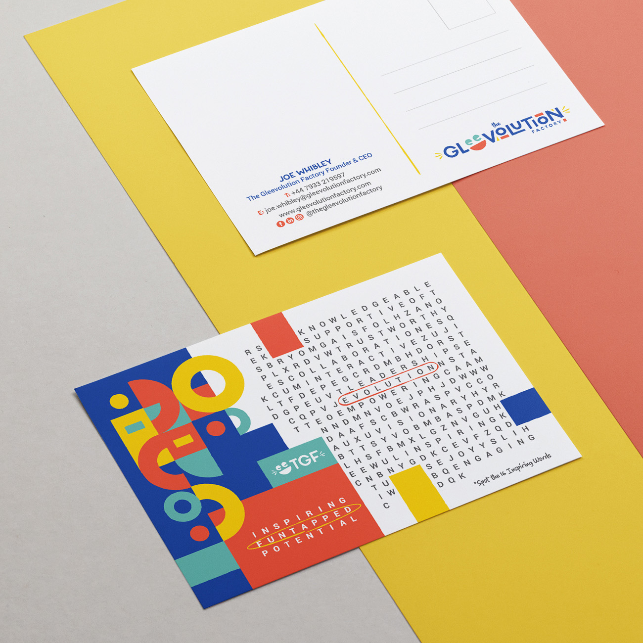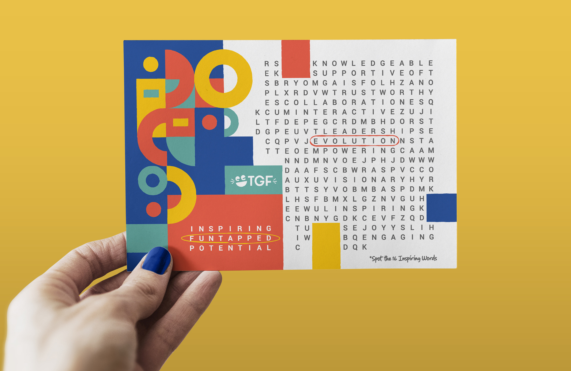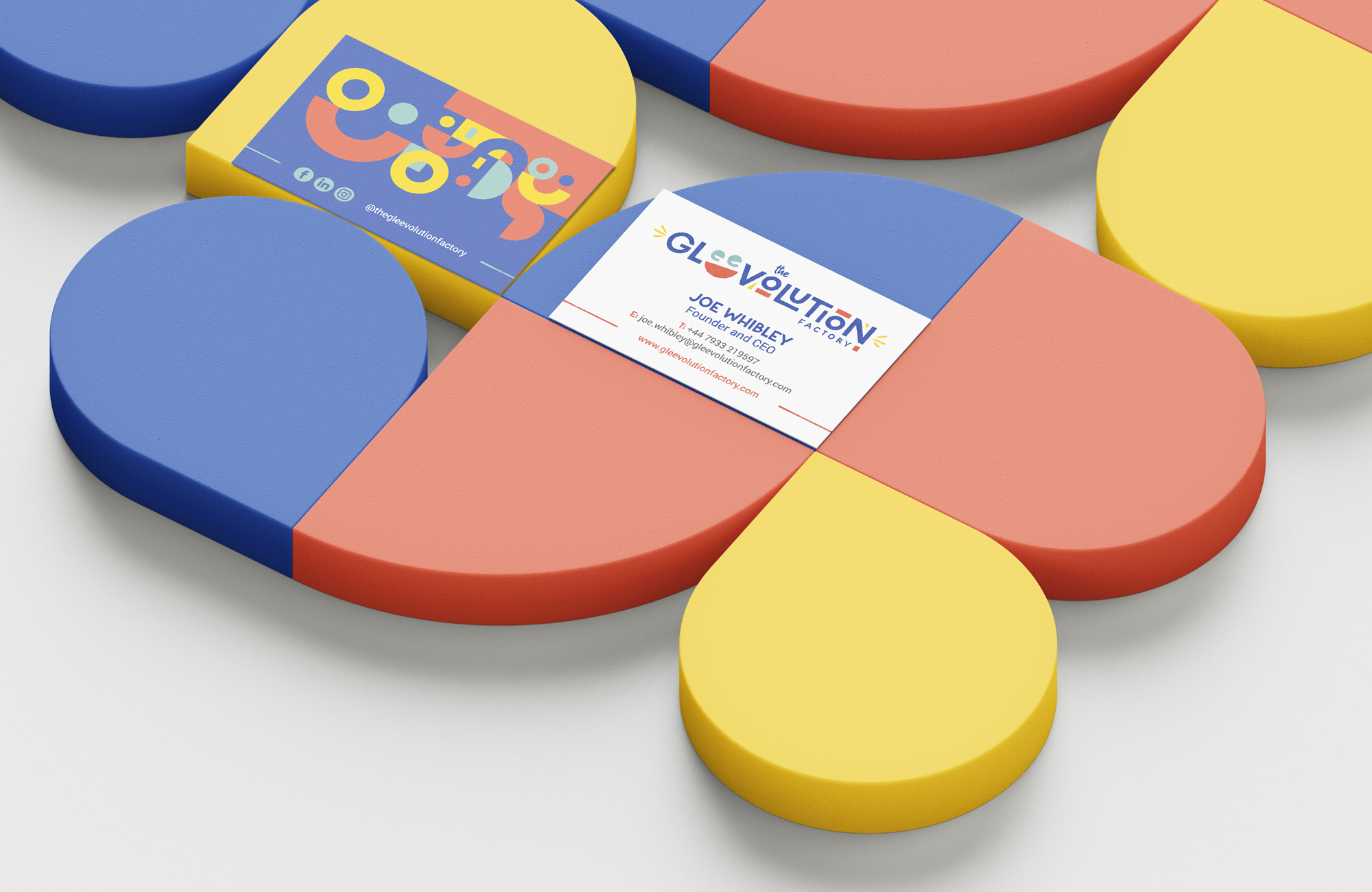
The Gleevolution Factory is a learning and development company that focuses on leadership, sales and customer service training sessions, by means of fun, engaging and practical learning methods. They required a brand identity that evoked the spirit of their training methods and their goal of making people smile and laugh at work, and learn through fun.
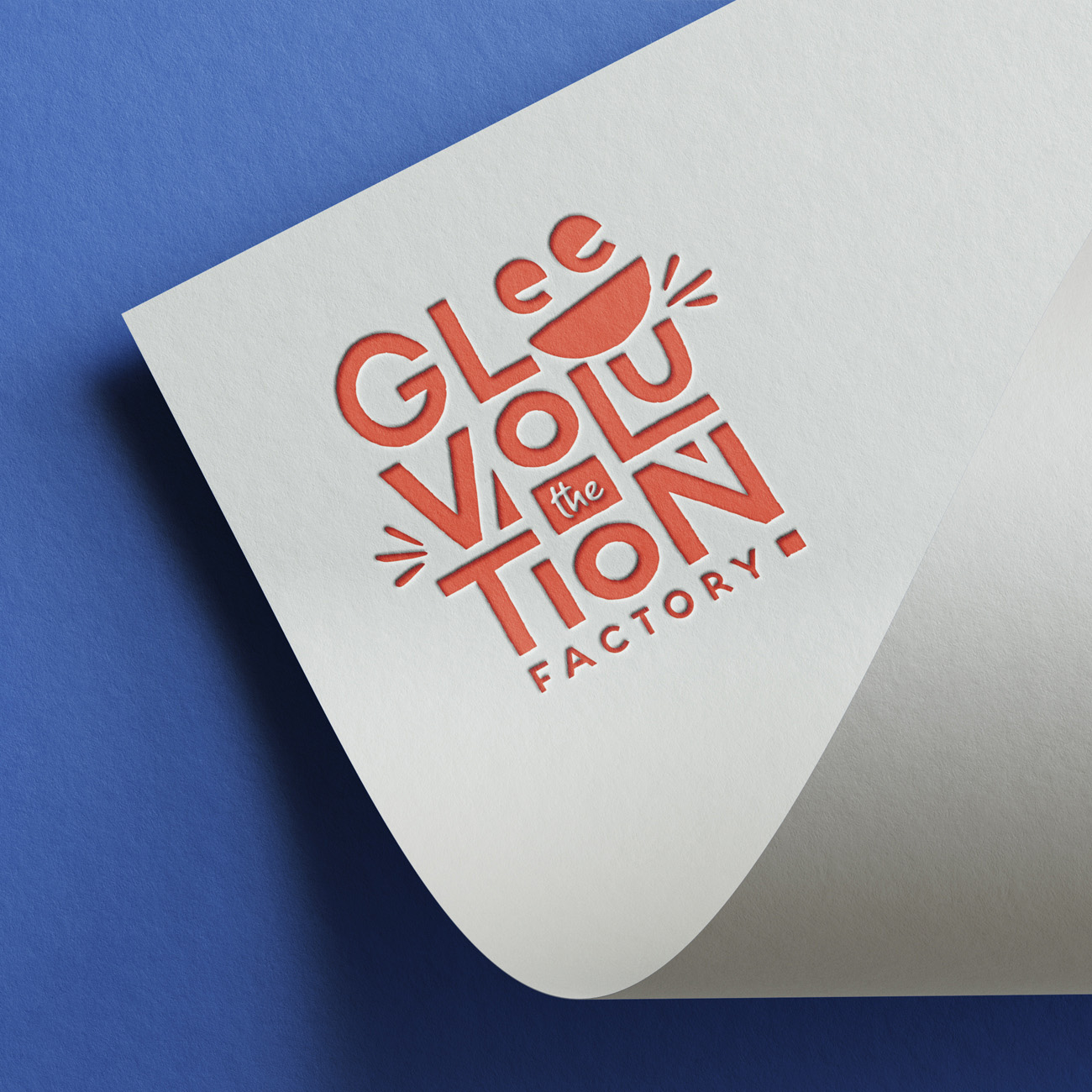
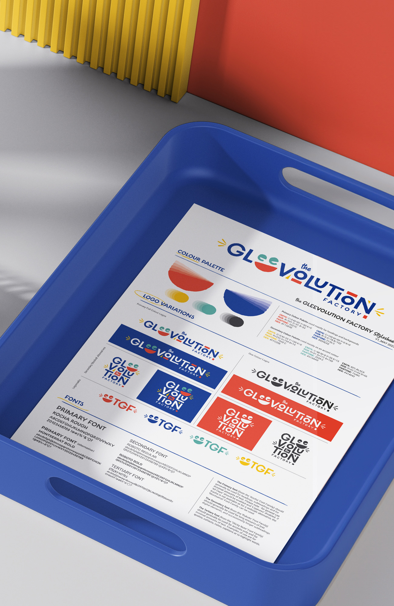
The font and texture of the letters and elements within the logo have a hand-made quality to make it feel approachable and add a human touch. A colourful palette was used to portray a fun bold identity that stands out and primary and secondary colours were used to add playfulness. The double letters ‘ee’ form a laughing emoji to represent the fun format of the training and the brands vision of making people smile / belly-laugh at work. The font used is playful and fun and the letters are stacked to give a feeling of game play and building blocks.