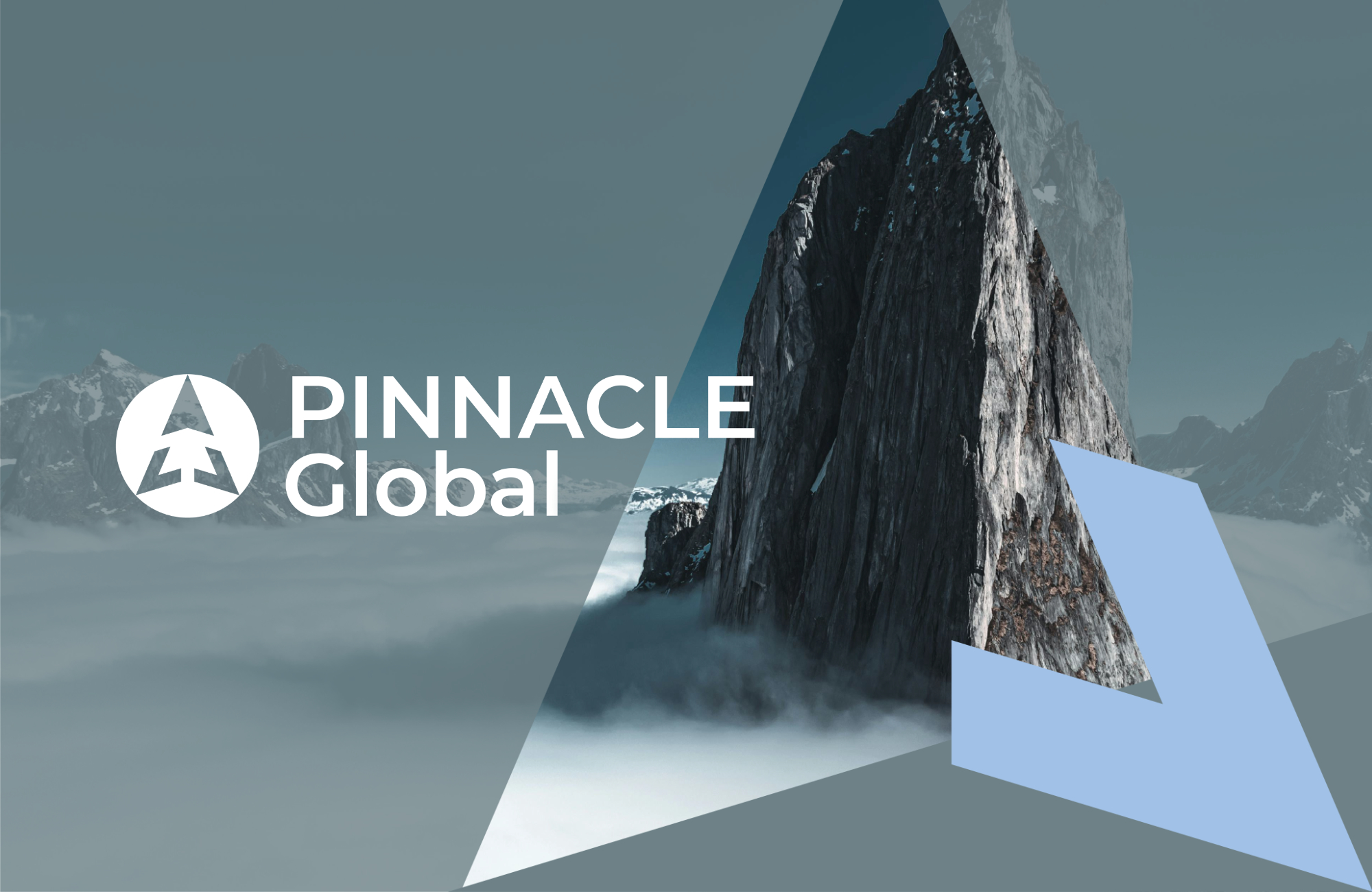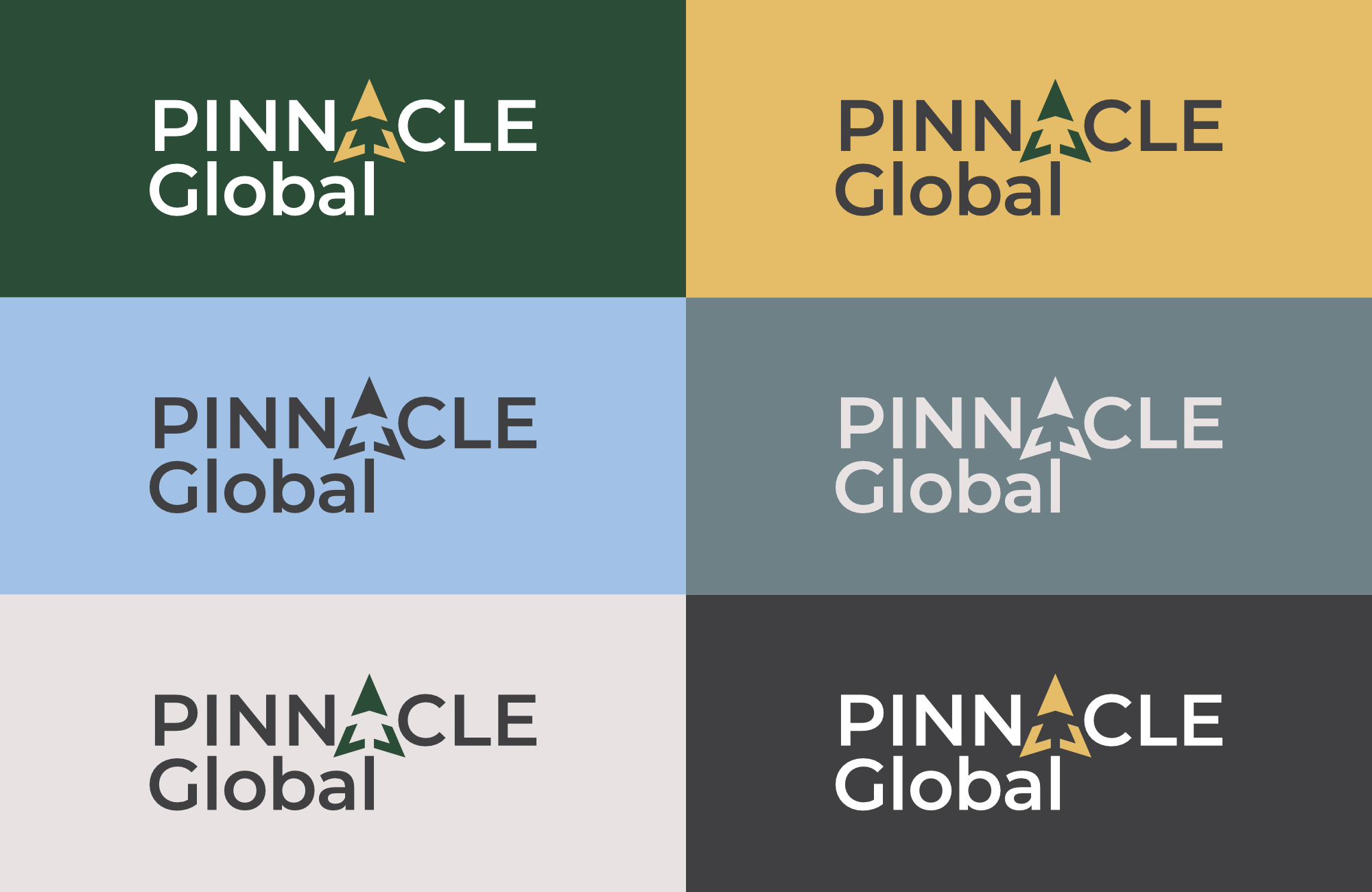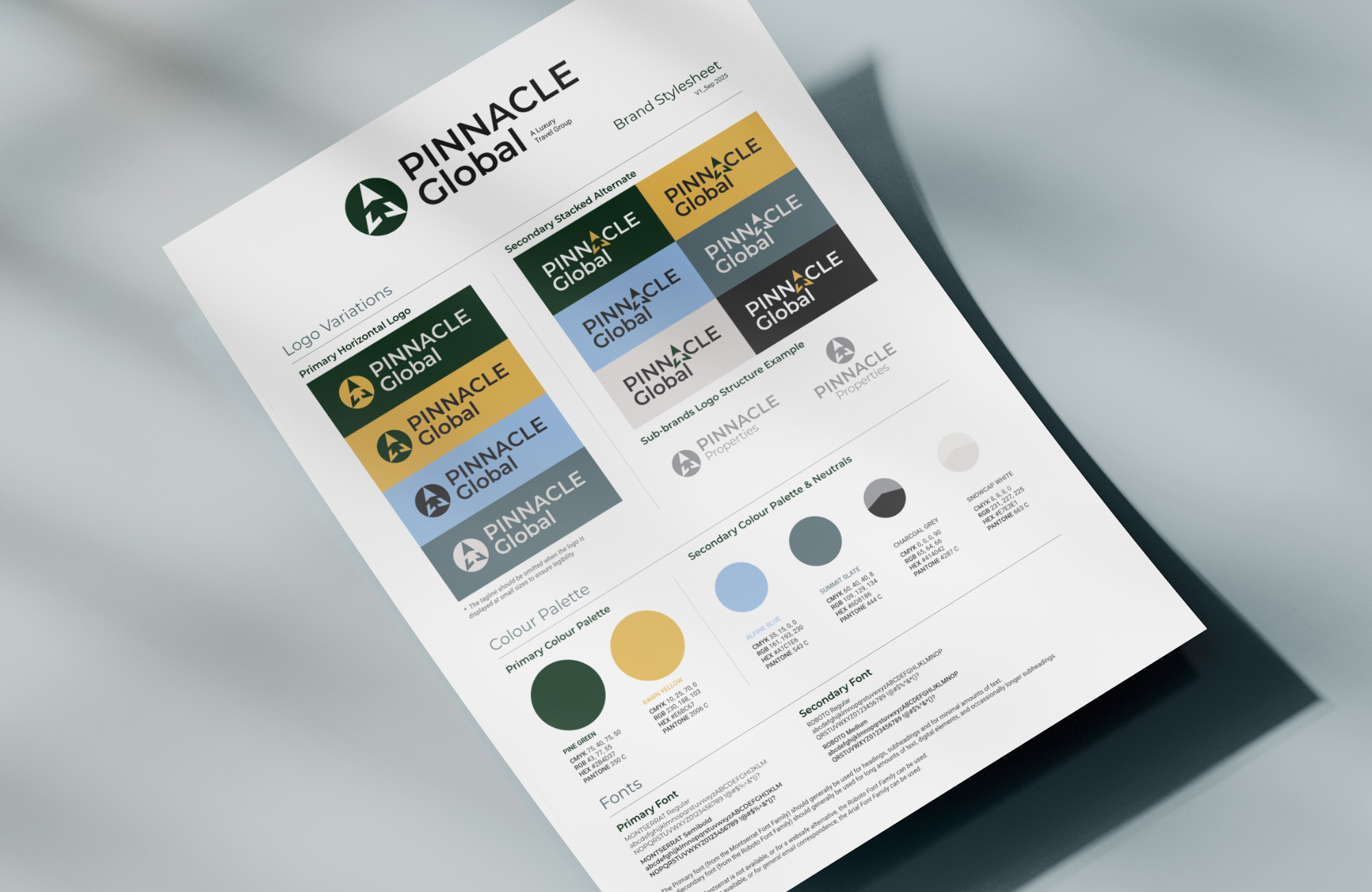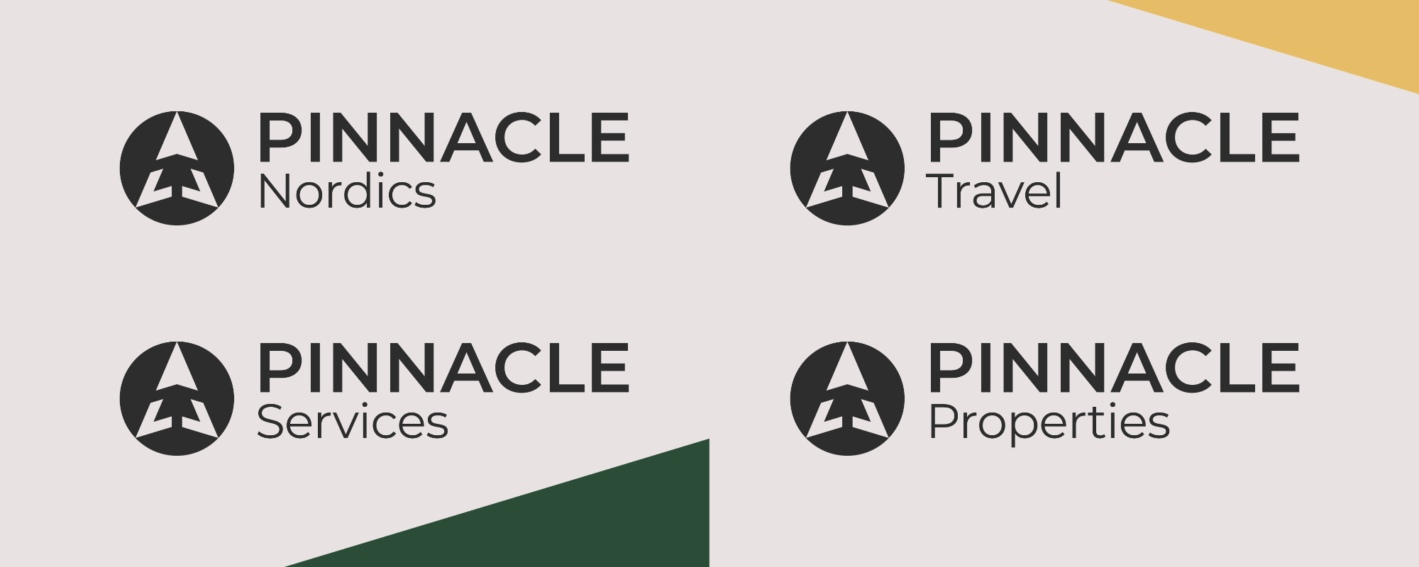
The Pinnacle Global is a luxury travel platform, with a focus exclusively in the Nordic regions. They required a logo for their parent company as well as 4 sub-brands, that followed a ‘Branded House’ logo structure. The visual identity included a slide deck and email signatures.
The logo-mark was designed in the form of a circle, symbolising the globe and reflecting the all-encompassing nature of the parent company and its associated sub-brands. The icon takes inspiration from the Nordic landscape - icy, snow-capped peaks and tall forest trees - rising upward toward the vast skies. The central triangular element represents a mountain, while the negative space within reveals a tree. The composition also forms an arrow, subtly alluding to a compass and reinforcing the themes of travel, direction, and exploration.