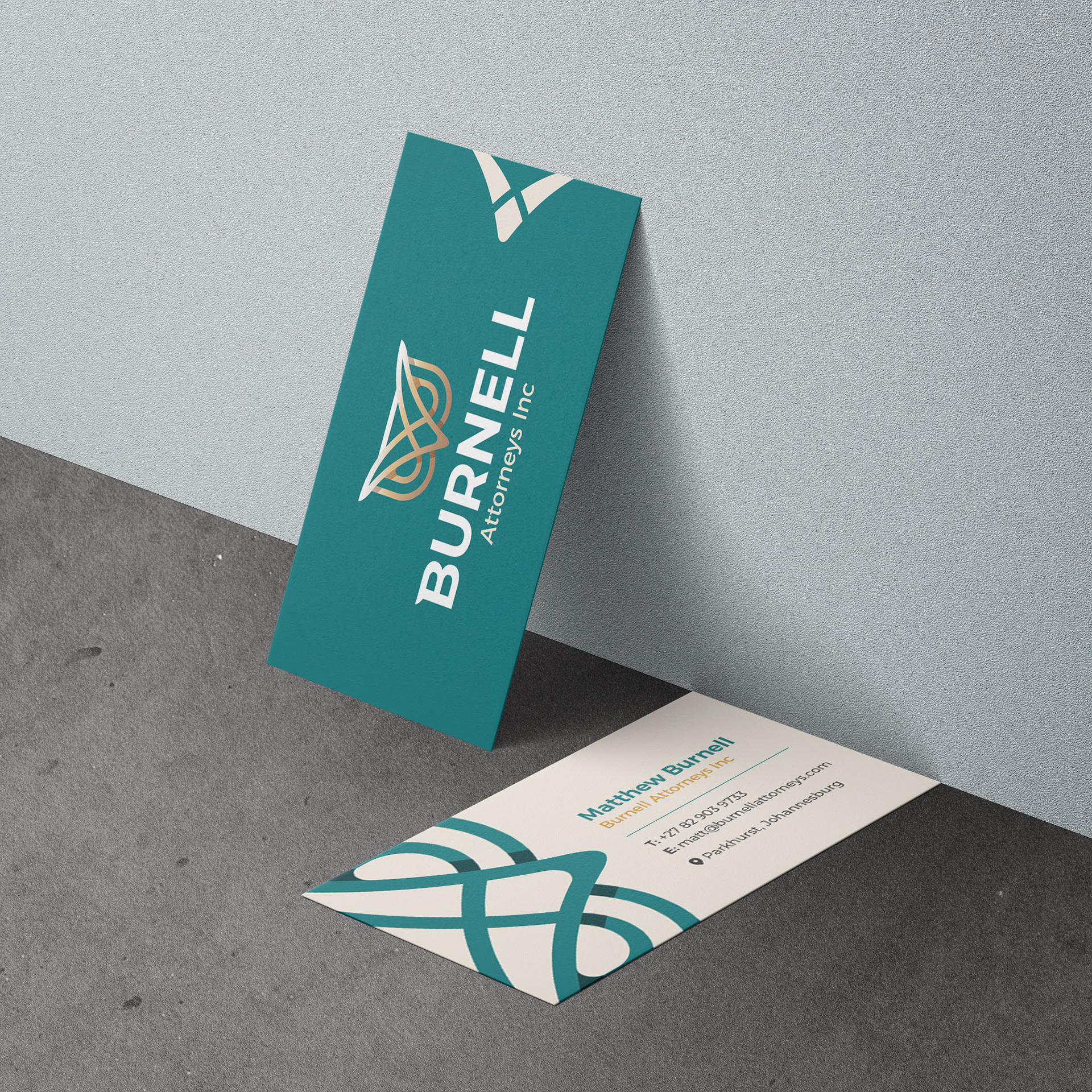
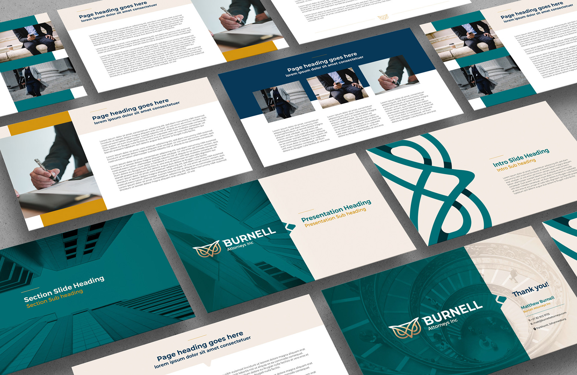
Burnell Attorneys Inc is a boutique ESG, sustainability and regulatory law firm, targeting Businesses predominantly in the mining, oil and gas, power and energy sectors. They required a modern logo and distinctive visual identity branding that exudes trust, expertise, and reliability.
This project was done in collaboration with 'The Collective One Agency'
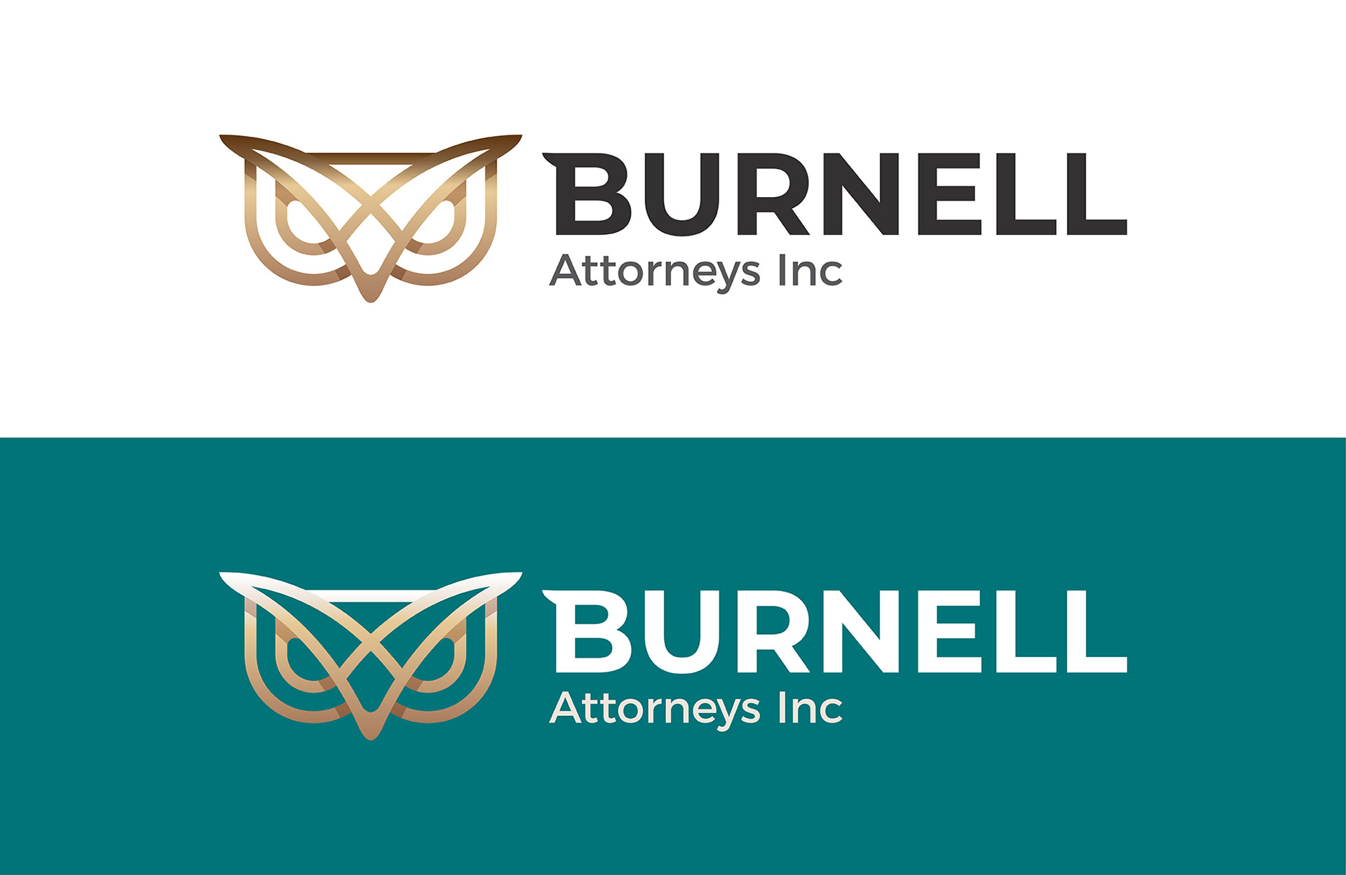
Logo Design Rationale: An icon has been created by combining the letter ‘B’ plus an owl and open book. The owl is a symbol of wisdom, protection and intelligence, which are qualities one looks for in a law firm. An open book forms part of the icon which also gives a feeling of trust, integrity, honesty and knowledge as well as symbolising the book of law. The icon is symmetrical to represent balanced views and fairness in the judicial process. The colour palette uses turquoise and navy blue. These colours inspire ideas of loyalty, confidence, security, and reliable authority. The font used is a clean and modern sans-serif font to show professionalism and to appear approachable